Tuesday, September 22, 2009

Learn how to sketch trees

Above about how to sketch trees.

Ever wondered how to sketch trees?

Sketch of trees is not difficult, but you have to learn some basic techniques to do well.

Because the trees are one of the most important elements in landscape painting, they need some time stuyding.

Although not necessary to be able to identify every tree by name, you should familiarize yourself with its features before you can paint the trees efficiently.

Your anatomy can be studied more thoroughly in the late fall or winter, when bare of leaves.

A typical example is the difference in the trunks of trees.

Typically, fast-growing tree much straighter than slow-growing one.

Note that, as a branch from the trunk, so you have some knowledge about what happens when you draw a tree of leaves, at a later date.

Part of "How to draw a tree" process consists of taking notes, when the bare trees. This will help you understand how the mass of green leaves or groups formed under the structure.


how to paint trees


This is another useful tip on how to sketch trees: When drawing or painting the foliage of the tree, look for the large masses first.

Try to see the entire tree as broadly as possible.

After indicating the largest masses, look for the secondary forms within these masses.

Disregard the leaves. Squint your eyes so that you see only the general masses.

Keep the mass effect in mind at all times when you are painting in color.

Choose a time of day when the light and shade areas are clearly visible, to help you to define the big shapes.
how to draw trees

When sketching trees, avoid the obvious green used by inexperienced painters.

Study the clusters of trees before you, noticing how some are more bluish than others.

Observe that what at first seemed to be a definite green in a neighboring tree really has a yellowish cast, while another may run to more brown.

Exaggerate these colors when you apply them to the canvas, and it is surprising how readily your eye will accept them as an interesting group of trees.

Your first efforts may contain some raw color but you will soon learn to modify it.

By using this approach in sketching trees you will avoid the deadly monotony of obvious green.

Study a branch in your studio. Take special note of the angles of how the smaller branches leave the larger one.

Note the gradual tapering toward the ends of the twigs.

sketching trees

To sketch a tree, add a decorative note to the subject by composing a painting so that the trees form a frame.

The spots of sky that are seen breaking through a tree are often painted too light.

When we look at these spots and see them enveloped by dark green leaves the contrastoften exaggerates the light that penetrates.

In order to keep these spots from "jumping out" of the tree, paint them in a slightly lower key than the rest of the sky.

The smaller the spot, the lower the key.

When sketching a group of trees, look for a light tree against a darker tree to add variety to the scene.

You will find it helpful to draw a tree as it grows, from the base upward, from trunk to branch to twig.

The area that it is to occupy can be lightly indicated, but when doing the actual drawing start at the base working upward and outward to the tips.

how to draw trees

Try to convey the feeling that the base of your tree is really growing out of the ground, with its roots gripping the earth.

Many beginners paint their trees as if they were upright logs, cut sharply and flush with the ground.

Avoid painting a clear, definite line where the tree meets the grass; soften the edge instead.

Notice how the grass is reflected upon the tree trunk and paint some of this greeninto the trunk.

drawing trees

An excellent "how to sketch trees" exercise is to make as many compositions as possible using the same tree as a motif.

You will learn how a tree can be a complete composition in itself, how the tree can influence the foreground, how it can become asubordinate element in a vista, how it can guide the eye to the middle ground or the distance. All of these points are essential when learning how to sketch trees.

Mistakes are frequently made in drawing the branches emerging from the main limbs.

Remember that the branches grow in different directions from the limbs.

Simplify the modeling of the trees as they recede by limiting the tonal range.

Watch the edges of your foliage; a sharply defined edge comes forward and a soft edge recedes.

Sunday, July 26, 2009

Basic rules for outdoor sketching

Here about basic rule for outdoor sketching.

There are 3 basic rules for sketching outdoors:

First, determine your horizon line, making sure that all your receding lines converge properly.

Sketch the general contours of the big shapes. Keep them fairly angular and avoid drawing details too soon.

sketching outdoors rule 1

Second, the same advice applies to shading.

Indicate the large masses first, in simple light and shade.

Avoid using halftones at this stage. Watch your source of light and keep it consistent.

Sketching Outdoors, Rule 2

Third, put in the half-tones, constantly checking the relationship of the light and dark values.

Then render the details and necessary accents in the final stage to complete the picture.

sketching outdoors rule 3

As you can see, these rules are very simple and easy to follow.

Now go out there, and do some sketching!

Saturday, July 25, 2009

Draw the human figure

Above about draw human figure.

The complex human form can sometimes seem like a huge challenge for the artist. Like any task, it becomes much more manageable if you break it up into 'bite-size' chunks instead of trying to 'swallow it whole'. To tackle figure drawing - sometimes called 'life drawing' - we will sometimes take an overview looking at aspects of drawing the whole figure, and sometimes look at drawing parts of the body. Over time, practice in all these areas will come together and you'll find yourself able to tackle any pose with confidence.

Learning to draw a nude model in a life drawing class is obviously the ideal, but if this isn't possible, don't despair. You can still learn to draw the figure very well without a model. You'll find that friends or family may be happy to model wearing close-fitting sportswear, and any drawing problem (observation, foreshortening, proportion) that you find on a nude model can equally be explored drawing arms and legs.

For best results, work consistently, practicing drawing daily. When reading, make notes in your sketchbook to remind you what to work on. When you are ready to move on, come back and takle the next exercise. Remember, you won't learn to draw by just reading about it! You have to put it into practice.

First, let's look at the basic proportions of the head and body, and practice sketching them.

Looking At Proportions
Find out the standard proportions of the human figure. The first page describes traditional proportions, while the second page shows you how to measure the model with the 'thumb-and-pencil' method.

Homework:
Once you've read the article carefully, ask a friend to 'pose' for you - clothed is just fine! - and do a sketch, using the thumb-and-pencil method to find how many heads tall they are, and marking key points on the figure. You could use a mirror, holding your sketchbook in one arm, if everyone is too busy! Try sketching some simple stick-figures using circles and ovals, using the proportions described.

Gestural Drawing
Practice capturing the essential qualities of the figure using gestural drawing. The examples in this article focus on strongly directional lines, but you can also try using loose oval forms to describe the body. Try a variety of energetic poses.

Friday, July 24, 2009

Technique of sketch

Here about sketch techniques.

Have you ever seen sketches either from an artist's sketchbook or in a gallery somewhere and there drawings always look really sketchy, there's something about them that you really like and want to emulate. Sketching isn't about drawing a likeness in a portrait or drawing things accurately, sketching is about being loose and bold and not worrying about making mistakes, letting your real feelings come out.

How to sketch techniquesThe whole point of sketching can be done in two different ways, one way is sketching as a preliminary to a painting or a finished drawing, the other way is just for the art and fun of sketching which if done properly can really turn into a work of art by itself. The sketch on the left is full of life and energy and you can only achieve this dynamic and rhythmic flow through sketching whether it is with watercolour, oil, charcoal, acrylic or any other medium.

How to sketch techniquesIn this detail of the same sketch we can see all the scribbles and marks that I have put down and each mark or scribble means something whether it is the form of the hair or the way tone has been laid in. The detail looks abstract in this example till we see the full sketch and then realise that everything is there that needs to be, look at the full size sketch and you can see what these marks and scribbles describe.

How to sketch techniquesTo do this sort of sketching you need to relax and let yourself go and not to be afraid of making mistakes and to have an understanding of form and shape. Once you know about form and shape try letting yourself go and lose all your inhibitions and preconceptions of what you might think drawing is all about. The example on the left is a simple sketch that is fluent and rhythmic, I wasn't really bothered about toenails or whether there was an highlight in the dogs eye. This sketch took two minutes to do and it is a good idea to set yourself a time limit to see what you can achieve.

Thursday, July 23, 2009

The quick sketch technique

Above about the quick sketch technique.

When drawing, a basic understanding of the rules of perspective is essential if you are to achieve a realistic effect. Only once you have learned these rules you can begin to distort or exaggerate them in order to accentuate elements of your design. There are three basic forms of perspective (one, two and three point). There are also three main elements present in each of these (the vanishing point, convergence lines and horizon line). This tutorial shows the basics behind one and two point perspective only, three-point perspective being a technique that automotive sketching does not require.
Horizon Line: This line, as its name suggests, describes the horizon, which is always considered to be at eye level. For instance, an object sited above the horizon line is above the viewer's eye level and will therefore show its underside.
Vanishing Points: Sited on the horizon line these are the points where all convergence lines meet. Although always on the horizon, their position on the horizon depends on the viewer's angle to the viewed object.
Convergence Lines: All parallel lines in a scene will always appear to converge to a single point (the vanishing points). The exception to this rule is that lines viewed in parallel or perpendicular to the viewer will not converge. In one and two point perspective you can also consider all vertical lines as non-converging lines.
One Point Perspective: One point perspective is evident when the object being viewed lies parallel or perpendicular to the viewer. This means that only lines travelling towards or away from the viewer appear to converge to a single vanishing point on the horizon. Picture one shows how this makes for a very simple version of perspective, which is especially useful for sketching quick side views of a vehicle.
Two Point Perspective: When the object being viewed lies at an angle to the viewer, as in the second sketch example, all the horizontal lines appear to converge. This therefore introduces a second vanishing point on the horizon. Where the vanishing points fall on the horizon line depends on the angle of the object to the viewer. Looking at picture two you can see that if the vehicle were turned so that more of the side was visible, then the right vanishing point would move to the right and out of the image.
Wheel Ellipses: Getting correct ellipses when drawing a car is probably the hardest part of perspective. Getting it absolutely correct will probably not add anything to your drawing, but getting it wrong however will make your drawing look very odd. If you look at a circle at an angle of 90 degrees then what you see is indeed a circle. Once you start to reduce the angle you view the circle from, it starts to appear to be an ellipse. An ellipse has a Major Axis and a Minor Axis. In picture three you can see where these are situated on an ellipse. The Major Axis divides the ellipse into two equal halves along the longest dimension, whilst the Minor Axis divides the ellipse into two equal halves along its shortest dimension. Although not technically complete (the full explanation is long, more complicated and not generally required when sketching) a good rule of thumb is that you should always align the Minor Axis with the axle of your vehicle. The Major Axis, and therefore the longest dimension of the ellipses should therefore run perpendicular to your axle line. Finally, how do you ensure that the angle of your ellipse is correct? There is a method using construction boxes, but in practice you should not need this for sketching. If you ensure that you have got all of the above correct then the angle, or width of your ellipse hopefully should be self-evident.

Wednesday, July 22, 2009

About The Quilting Arts Book

Here about The Quilting Arts Book.

Today's tip is for free-motion machine quilting and it comes from The Quilting Arts Book: Techniques and Inspiration for Creating One-of-a-Kind Quilts, by Patricia Bolton, a great book full of ideas, projects and tips for making artistic quilts. From principles of design to sketching to quilting and embellishment techniques to gorgeous quilts, The Quilting Arts Book is full of art quilt inspiration.
In it Robbi Joy Eklow, Quilting Arts Magazine's Goddess of the Last Minute shares her free-motion machine quilting technique and tells how to make 16 fun free-motion quilting designs. She gives many tips as well. My favorite is, "This is not billiards, in which you have to say what you plan to do before you try to do it. If you are striving for a motif and it morphs into another shape, go with it."


Tuesday, July 21, 2009

Sketching tips that designer should know

Above about sketching tips.

Live sketching gets people engaged in the discovery process and leads to ideas that may not have presented themselves via normal note-taking. The response to visuals being created before a clients’ or colleagues’ eyes is energetic, and that leads to a natural desire to fill in the picture, completely. The result: Understanding and alignment, quickly.

Materials you’ll need:

  • Whiteboard or giant stickies
  • Variety of small, colorful stickies
  • Markers
  • Digital camera

How to do it:

  1. GET STARTED | Start drawing as soon as you can. The earlier you start drawing in a session the better. It will get the momentum going in the room, the energy level will jump and you’ll start getting real content.
  2. VISUAL NOTES | The key to live sketching is understanding that it isn’t “drawing” in the traditional sense. It’s visual note-taking. Instead of writing “there was a room with a couch and a lamp,” you draw a couch and a lamp and label it with the word “room.” This simple distinction between drawing and note-taking helps alleviate the fear of drawing in front of people.
  3. MESSY IS OK | Yes, sloppy is good. The sketches don’t have to be pristine. The sketchier they are the better. By keeping things fast and loose you’re subconsciously telling the audience that these are just notes and not final images. What’s drawn in session isn’t necessarily going to show up in a final XPLANATiON or another visual communication piece. Keeping things sketchy will help drive that point home, and allow everyone to feel like they can add to the pictures themselves.
  4. ASK | Don’t be afraid to ask for clarification or detail. If things are moving too fast, and you aren’t catching everything, let your partner — or the group — know. If the description doesn’t make sense, ask more questions. If you’re not sure whether you’ve captured something correctly, ask your client or colleague. It’s better to ask and be sure, than to assume you’ve got it and have to fix things later.
  5. LABEL | Remember that you’re the one that will have to make sense of these notes after the fact, so annotate/sketch/label in a way that makes sense to you. Label people, label scenes, label arrows, label labels! Live sketching can be fast and sloppy, as mentioned above, and the squiggle you draw in a session might make complete sense to you at the time — but two days later it will just be a squiggle. Labels make the difference between a “centralized supply chain database that everyone has access to” and a bunch of mysterious boxes, lines and stick figures.

When you’re done, document everything with a digital camera being careful to avoid window and flash glare on the whiteboards. It’s a good idea to organize and annotate all of the relevant captured info soon after the session.

Sunday, July 19, 2009

The color and drama of painting

Above about color painting.

Bartlett's exhibit explores the color and drama of fish schools and seabird flocks in a series of original paintings and college pieces. Hailing from St. Andrews, Scotland, he was able to vividly capture the movements and behaviors of Maine's seabirds because many of these seabirds are found in both places. On the 22nd, he will discuss his background in biology and the techniques he used to create such a vibrant and dynamic group of paintings.

Boat tour trip
For the Farnsworth, Bartlett will lead an artistic exploration of coastal bird life. Participants will enjoy sketching puffins and rare terns en plein air on a boat excursion from Port Clyde to Eastern Egg Rock, followed by creating collage/mixed media paintings from the source material back at the Farnsworth.

Bartlett will demonstrate his technique of using ripped magazines and paper in conjunction with paints to construct intriguing collages, as well as offering tips on composition and technique. Bartlett is a self-taught artist with a doctorate in animal behavior, and he is the guest artist of National Audubon Society.

The excursion is co-sponsored by Project Puffin in Rockland and will meet 11 a.m. at the Monhegan Boat Line in Port Clyde, returning at 6 p.m. Intermediate to advanced students with basic drawing and painting skills are encouraged to sign up.

Class size is limited to 12 students and a materials list will be provided upon registration. The fee of $100, $85 for museum members, includes the boat passage.

Saturday, July 18, 2009

Simple sketch effect with photoshop

Here’s about simple sketch with photoshop.

This Photoshop tutorial will show you how to create an extremely simple sketch effect. You can apply this effect to any digital image. The greatest thing about this effect is its simplicity.

Step 1: Preparation

Open the image to which you want to apply the sketch effect. Duplicate the layer by pressing ctrl (command) + j on the keyboard. Select image > adjustments > desaturate from the menu. Duplicate this layer by pressing ctrl (command) + j on the keyboard. Invert the layer by pressing ctrl (command) + i on the keyboard. Set the blend mode to color dodge.
Color Dodge

Step 2: Apply Sketch Effect

Select filter > other > minimum from the menu, and set the radius to 1 or 2 pixels. The larger the radius the darker the lines will be.
Minimum filter set to 2

Step 3: Adding Color (Optional)

You can now add color by simply duplicating your original image layer by selecting it in the layers palette, then pressing ctrl (command) + j on the keyboard. Move the duplicate to the top of the layer stack, and set the blend mode to color.
Color

That's all there is to it.

Friday, July 17, 2009

Learn how to sketch

Above about sketching tips.

1. Find a sketch pad at the next art supply store. It can't be emphasized enough. Select one of those nice sketchbooks and take it with you everywhere you go! It permits you to use every free minute for exercising your draftsmanship and draw interesting scenes you come across.


2. Save your draftings safe. As crucial as having a sketch pad (and keeping them after you have filled them) is to preserve everything you depict. Acquire a folder to store them safe and secure from harm. Never toss any of your pictures. So you will collect a nice portfolio and can consult your older works for inspiration and to follow your progress.

 
3. Pick apart your draftings later. Remember, we discussed in the part about fighting your fear of failure - don't be too judgmental about your drawings. Whenever the little critic in you wants to jump into action, outwit him. Stash away your work (in your folder) and tell him "later". In some weeks or months you can see your drawing in a very much more friendly light than nowadays.

 
4. Drawing from reality is ideal. You'll see: depicting real-life subjects seems to be more difficult than just replicating pics or other pictures. But it is much more honoring and your pictures will be much more vital and truthful. How does it work? I don't know sure enough, but I would speculate our subconscious somehow absorbs the scenery with all senses giving you additional inspiration to draw on the paper.

 
5. Do not depict complicated subjects. Stand back from subjects that are too complicated. Rather start with simple subjects you are able to understand and depict as good as you desire it to be. Then increment the level of difficulty in petty steps so your draftsmanship has time to grow with each small step you are undertaking.

 
6. Do not move into detail excessively. When drawing, less is more. Virtually everyone tend towards adding details excessively, too many little lines, too many insignificant objects. Do not try to depict all the details you can see. Rather seek to capture the scene at large, absorb how it feels and try to put this to onto the sheet using only few lines.

 
7. Exercise, exercise, exercise. Oh and did I mention ? Practice! You cannot draw overly often. All of the time bear in mind: every line you draw, every picture or sketching you complete increases your draftsmanship and moves you one stair up. Practise by drawing scenes you encounter in everydays life into your sketch pad. Practise by doing the practices I have presented. Just practise.

Mistakes beginners make for sketch

Here’s about the mistake that beginners make when sketch.

1. Drawing With a Hard Pencil

If you have no very dark shadows and the whole picture is rather pale, check your pencil. Are you using a Number2 (HB) pencil? These are too hard to draw with (though they are handy for light shading). Get a B, 2B and 4B for darker values. Read more about pencil grades.

2. Portraits from Flash Photography

This is the major cause of beginner drawing problems. Using flash photography flattens the features, giving you nothing to work with. When the person is facing you, it is very hard to see the modeling of the face, as the perspective vanishes behind their head, and add a cheesy snapshot grin and you make life very hard! Have the person turning slightly to one side so you can model their face, with natural lighting to give good skintones, and a natural expression to show their real personality.

3. Incorrect Head Proportions

Because of the way we focus on a person's features, we usually draw them too big and squash the rest of the head. Learn about the correct head proportions

4. Twisted Features

Because we are used to looking at a person straight-on, we naturally try to make their features look level when we draw them. If their head is on an angle, this results in strange distortions in the picture. Sketch guidelines first to ensure that the features are on the same angle as the rest of the face. Learn more about drawing the human head.

5. Pet Drawings from Human Eye Level

When you take a photograph standing up, you are looking down at your pet. They have to look up, and you end up with their head seeming much bigger than their body, and a rather odd expression on their face. Have someone distract them so they aren't staring down the lens, and squat down so the camera is at their head level, and you'll get a much better reference photo. Read more about pet photography for drawing.

6. Being Afraid of Black

Often when shading, the shadows don't go past dark gray. If your value range is restricted to in some cases half what it ought to be, you are limiting the modelling and depth in your drawing. Put a piece of black paper at the corner of your drawing, and don't be afraid to go dark. Really dark. Improve your range of tone.

7. Outlining in Value Drawings

When value drawing, you are creating an illusion with areas of tonal value. When you use a hard drawn line to define an edge, you disrupt this illusion. Let edges be defined by two different areas of tonal value meeting. Read more about Value Drawing.

8. Drawing on the Wrong Paper

If your drawing is pale, it might be the paper. Some cheap papers have a sheen on the surface that is too smooth to grab the particles off the pencil. A thick notepad has too much 'give' under the pencil to allow you to apply enough pressure. Try a basic photocopy/office paper, or check the art store for cheap sketch paper. Place a piece of card under a couple of sheets to give a firmer surface. If you are trying to do even shading, some sketch papers can be too coarse, giving an uneven texture. Try a hot-pressed Bristol board or similar smooth drawing paper. Find out more about paper

9. Scribbled Foliage

Don't use circular scribbles to draw foliage. Use more convex shaped scumbling - like crescent shapes and scribbly calligraphic marks - to draw the shadows in and around clusters of foliage, and your trees will look much more realistic.

10. Wiry, Pencil-Line Hair and Grass

If you draw every hair or blade of grass as a pencil line, you'll end up with a horrible, wiry, unnatural mess. Use feathery pencil-strokes to draw the shadows and dark foliage behind areas of grass - just like drawing short hair in this drawing hair tutorial.

Thursday, July 16, 2009

Sketching is different from painting

Above about why sketching is different from painting.

Because the result is more immediate, I never spend more than one session on a sketch and rarely go back to adjust it later. This makes sketching more like a musical practice session. Before starting, I decide what new technique or criteria I want to work on...color harmony, focal point, mood, perspective, source of light...right now, you can tell from my previous tips, I am working on composition and hope that establishing the darks first may be helpful. When painting, there are a lot of things to consider and one must address them all at once. With sketching, the process and not the result, is what is important. So with each specific sketch, I can concentrate on getting one thing right...warm or cool colors, line quality, scale, soft or crisp edges, foreground vs. background. You know the list.

Wednesday, July 15, 2009

Artists can't use black

Here's about why artist can't use black.

For some reason student artists are told they should not use black. So they end up using too few darks and their paintings often lack strong contrast, punch, or what is sometimes called "eye pop." The no black rule may come from the theory that color mixes are interesting while black is just one pigment. After years of following the no black rule, I now use Winsor Newton's Sepia for a warm black and sometimes make a cool black by adding a Paynes Grey wash over my black ink.

Tuesday, July 14, 2009

Talks about watercolor with ink

Above about watercolor with ink.

Many artists say that transparent watercolor is more difficult than oil because white and light areas must be reserved during the painting process while,
with opaque oils, highlights can be added for the final touch. Try starting with hot press watercolor paper, a waterproof black ink such as Platinum Carbon or Noodler's Bulletproof, and a waterbrush. Sketch with the ink and, with the brush, pull gray washes of every shade from the black lines. After the ink and washes dry, use watercolors to glaze hues over the varying gray tones. To me, this initial placement of darks on my paper, makes it much easier to arrange objects in a picture and create a balanced composition that will pull the eye in to a good focal point. Teachers have sometimes used a similar method by having students first sketch in charcoal to establish tones and spray with fixative before painting with watercolor. New waterproof inks offer an easier technique.

Monday, July 13, 2009

Sketch when inspiration comes

Here's tip of sketching.

Keep your smallest fastest sketching kit next to the spot where you read newspapers or magazines. When you see a reference picture you like, grab your tools and take five minutes to put it on paper right then...not later. You can also sketch when you are viewing videos online. Just pause the frame at an inspiring scene, animal, or person. It's like asking your own live model in motion to hold the pose for five.

Tuesday, June 30, 2009

Seven Sketching Tips

Above about sketching tips.

In recent parts you discovered how to interpret your subjects better, to master your fear of failure and how to use your draftsmanship determinedly.

Within this part I'll present you 7 crucial tricks that will help you with the following steps of your draftsmanship career:

1. Get a sketchbook at the next art supply store. This can't be emphasized enough. Choose one of those nice sketch pads and take it with you everywhere you go! It allows you to use every spare minute for practicing your drawing skills and depict interesting sceneries you come across.

2. Keep your pictures safe. As crucial as having a sketch block (and preserving them after you have filled them) is to keep everything you sketch. Acquire a folder to stack away them safe from harm. Never throw away any of your pictures. So you will collect a nice portfolio and can consult your late oeuvres for inspiration and to keep track of your advancements.

3. Pick apart your drawings later. As we read in the part about fighting your fear of failure - do not be excessively judgmental about your pictures. If the small critic in you wants to jump into action, outmaneuver him. Store away your work (in your folder) and tell him "later". In a few days or weeks you'll see your creation in a much more friendly light than nowadays.

4. Depicting from life is superior. You will find out: depicting real-life objects seems to be more difficult than merely copying pics or other pictures. But it's much more rewarding and your pictures will be much brisker and realistic. How does it work? I do not know sure enough, but I'd think our minds for some reason assimilates the scenery with all sensory faculties returning you a lot of inspiration to draw on the paper.

5. Do not draw complicated objects. Stay away from objects that are too complex. Instead commence with simple objects you are able to understand and depict as proficient as you want it to be. Then increase the difficulty in petty steps so your drawing skills has time to grow with each little step you are confronting yourself with.

6. Do not go into detail too much. When sketching, less is more. Most of us tend towards inserting details excessively, too numerous little lines, too many insignificant objects. Do not attempt to depict all the details you can see. Instead attempt to capture the scene at large, absorb how it feels and put this to into your sketchbook utilizing only few lines.

7. Exercise, exercise, exercise. Did I tell you? Practice! You cannot sketch too often. Ever keep in mind: every line you draw, every drawing or outlining you polish betters your drawing skills and brings you one step forward. Exercise by drafting sceneries you come across in everydays life into your sketchbook. Exercise by doing the examples I've demonstrated. Just practice.

The Smart Drawing

Here's about CorelDraw Tool.

Draw smarter with CorelDraw Tool. Has anyone harrow the end of time after time known you well-head adequate to consume your sentences? Well, that’s controlled by the meteorological conditions of how a man of the most intuitive duplicate tools in CorelDRAW works. The Smart Drawing decorate was earliest introduced in CorelDRAW 12 to communicate freehand sketching the examine for of a countryside of faked facts. You can sketch a contours freehand-style on process and destruction up with a perfect vector butt as a curve, clan butt or Perfect Shape. above all You’ll bring the Smart Drawing decorate (shown below) located in the Toolbox between the curve tools and the rectangle tools-or you can weigh on the S hotkey for the specifically quick quote. When sketching curves, this decorate is able of automatically recognizing a army of geometric characteristics.

above all You can permission the Smart Drawing decorate with a stylus and duplicate lozenge, but august mousing skills move up ethical as well-head. For illustration, two lines sketched side fully side can be recognized as matching unmixed lines. Sketching choppy shapes that entertainment a gag on nobility cusp corners can bring about perfect 90-degree angles, like this: above all When duplicate clan geometric shapes, sketched boxes and squares metamorphose into right rectangles, settled with rounded corner properties that you can appeal. Sketched ovals and circles are recognized as right ellipses that you can attitude into arcs or pie shapes if you disposition. But after you’re done, CorelDRAW takes a on a short concur time after time to metamorphose your sketches. You can also sketch other complex geometric shapes such as arrows, equilateral and isosceles triangles, diamonds, trapezoids, parallelograms and so on, which metamorphose into Perfect Shapes”, like these: above all While the Smart Drawing decorate is selected, you can perceive as disposition as you impecuniousness to settled your sketched shapes.

To do this, two cue options check how accurately shapes are recognized and smoothed. You’ll bring these options in the Property Bar (shown below). Setting these interconnected options approve you to check how closely your sketched shapes are translated. above all Smart SmoothingAfter your sketched contours is settled, a bloody of node smoothing is applied in non-alphabetical to make the grade b arrive butt acceptance perfect. above all lowering Here’s how the Smart Drawing decorate options attend to arrange for check once again acceptance and smoothing: Shape RecognitionThis election sets how on the nail your sketched contours is matched to a recognizable contours and can be choose to a man of five levels ranging from Lowest (sketched shapes are not explicitly recognized) to Highest (sketched shapes are explicitly recognized), with Medium as the non-performance and None turning the blot free unqualifiedly.

This election enables you to choose that smoothing also pressurize, much the selfsame as applying smoothing to a natural course. Choose from a man of five options ranging from Lowest (less smoothing applied) to Highest (more smoothing applied), with Medium as the non-performance and None turning the blot free. above all These two options move up together, enabling CorelDRAW to do its acceptance necromantic.

Aim to be dependable the sides of the contours vertical and jet plane as you attract. Technically speaking, here’s what the Smart Drawing decorate is able of recognizing using non-performance acceptance and smoothing options: Ovals and Circles - Translate as clan ellipse objectsBoxes and Squares - Translate as clan rectangle objectsLines - Translate as curve objects (either unmixed or curved depending on how they are sketched)Triangles - Translate as curved objects or as finish triangle shapes (either isosceles or equilateral)Diamond - A sketched contours resembling a skewed quadrilateral last wishes as metamorphose into a finish diamond shapeParallelogram - A inartistically sketched four-sided contours whose B-side sides are matching and colleague last wishes as metamorphose into a finish parallelogram shapeTrapezoid - A inartistically sketched four-sided contours that has two matching sides and two non-parallel sides last wishes as metamorphose into a finish trapezoid shapeArrows - Two inartistically sketched generous paths that be like an arrow pointing last wishes as metamorphose into a Perfect Shape arrow, like this: above all To suffer the duplicate power of the advanced Smart Drawing decorate, whack at these compendium steps:Choose the Smart Drawing decorate (or weigh on the S hotkey) and permission a click-drag also pressurize to sketch a quadrilateral or rectangle. After releasing your mouse button, CorelDRAW automatically translates your sketch into a rectangle contours, like this: above all Choose the Pick decorate and remarkable in your Status Bar dissertation. The contours you sketched is specified as a Rectangle, and the Property Bar features options associated with shapes created using the Rectangle decorate, including the rounded corner options. above all Choose the Smart Drawing decorate again and sketch an ellipsoidal or clannishness. When releasing the mouse button, CorelDRAW translates your sketched contours into an ellipse, like this: above all Choose the Pick decorate and remarkable in your Status Bar.

Aim to be dependable the contours oriented either vertically or horizontally. The contours you sketched is specified as an Ellipse and the Property Bar features options associated with shapes created using the Ellipse decorate, including Ellipse, Arc and Pie states. Perfect Shapes and Glyph NodesSince tried and true shapes you sketch can be recognized as Perfect Shapes (such as triangles, trapezoids and parallelograms), it may pharmaceutical to be aware a baby inartistically these specialized objects. above all Sketched shapes that are recognized as Perfect Shapes are the selfsame as the ones you would typically attract using the Perfect Shape decorate. For illustration, the contours representing a triangle features a celibate glyph node that enables you to choose a man of the angles but be dependable the all-embracing orderliness of the contours. But these Perfect Shapes each blot lone “glyph” nodes that can be manipulated to alternate their proportions while preserving tried and true aspects of their contours. above all You can reorganize glyph nodes be like to the mode you proselytize the check points on a polygon.

As they’re moved, glyph nodes entertainment a gag on the less of resizing, changing harmony or dynamically going a tried and true exposВ of the contours. above all For some hands-on suffer creating a Perfect Shape with the Smart Drawing decorate, whack at these steps: Using the Smart Drawing decorate, sketch the contours of an isosceles triangle (a three-sided contours with two colleague angles). The contours is identified as a Perfect Shape. On releasing the mouse button, CorelDRAW translates your sketch into a Perfect Shape, settled with a glyph node, like this:Choose the Pick decorate and remarkable in your Status Bar. Use the Shape decorate next to click and shamble the glyph node (the red marker) to proselytize your shape’s proportions.

Tuesday, June 23, 2009

Tips to sketch a human body

Above about tips to sketch a human body.

What artist hasn't had the urge to draw the human form? But wanting to draw it and actually accomplishing a realistic version are two separate things, unfortunately.

But there is help! This article is here to cover all the basics, from the proportions of the human body to how to find subjects.

1. Proportions

The human body comes with easy to follow standards to use as a guide when drawing. The human head can be used as measurements for the body. For example, the average male body is 7 1/2 head lengths long. So, you can take the length of the head and multiply it by 7 1/2 and you will come up with the length for the entire body.

The basic rule of thumb is:

Average Male:

  • 7 1/2 heads tall
  • Shoulders are 2 heads lengths wide
  • Hips are a little over 1 head wide

Average Female:

  • 7 ½ heads tall
  • Shoulders are 1 ½ lengths wide
  • Hips are 2 heads wide

On both female and male, the hand is generally as long as the length from the hairline to the bottom of the chin and from the point of the chin to the back of the neck.

2. Choosing a Subject

This can be hard, most people don't like to be stared at. You really don't have to ask to draw someone, but don't make a show of it. The more covert you are the better. Try getting a back booth at an all-night waffle house and drawing the characters you see there. Or sit on the back pew of a church service. My favorite sketching time is to sit in the parking lot of a shopping center and drawing the people passing. They can't tell you're watch, or drawing for that matter.

3. Getting Down the Important Stuff

When sketching a person you really just want to catch the things that make that person unique. Whether is their quirky smile, loose legged stance, or their unusual attire, you want to cement that part on the page before adding anything else. Humans are flighty, they may not stand still long enough for you to get all of it.

4. Practice

Monday, June 22, 2009

Drawing and sketching tips

Here's about drawing and sketching tips.

Color Symbolism
color symbolism and psychology - interpreting the meaning of colour doodles and symbol analysis in drawing. What do colors mean? what is the symbolism of the colors red, green, and blue?

Doodle Symbolism - Mark Making and Line Weight
symbolism of doodles - lineweight and mark making - interpreting the meaning of doodle drawings and symbols in drawing - psychoanalysis of drawings importance of marks scribbles and style

Symbolism - Boxes and Three Dimensional Forms
meaning of box doodles - interpreting and analyzing the meaning of three-d doodle drawings and 3D symbol analysis in drawing

Doodle Symbolism - Arrows
symbolism of arrow doodles - interpreting the meaning of doodle drawings and symbols in drawing - psychoanalysis of drawings

Doodle Symbolism - Houses
symbolism of house doodles - interpreting the meaning of house doodle drawings and symbols in drawing - psychoanalysis of drawings of houses

Doodle Symbolism - People, Faces and Features
meaning of people and face doodles - interpreting the meaning of doodle drawings and symbols in drawing - psychoanalysis of drawings of faces

Brick Wall Symbolism
brick wall doodles - interpreting the meaning of doodles and symbols in drawing

Symbolism - Geometric Shapes
the meaning of shapes - interpreting the meaning of geometric shapes, doodle drawings and symbol analysis in drawing circles and squares

Doodle Meaning - Page Placement
doodle interpretation - significance of page placement in interpreting the meaning of doodles - psychological assessment of doodles

Symbolism - Abstract and Random Shapes
the meaning of abstract doodles - interpreting the meaning of abstract shapes, doodle drawings and symbol analysis in drawing random forms

Doodle Drawing - Flower Symbolism
meaning of flowers - interpreting the meaning of flower doodle drawings and symbol analysis in drawing flowers, analyzing flower doodles

The Meaning of Ladders
meaning of ladders - interpreting the meaning of doodle drawings and symbol analysis in drawing

Sunday, June 21, 2009

Let's draw smarter

Draw smarter with CorelDraw Tool.

Has anyone ever known you well enough to finish your sentences? Well, that’s sort of how one of the most intuitive drawing tools in CorelDRAW works. The Smart Drawing tool was first introduced in CorelDRAW 12 to give freehand sketching the benefit of a kind of artificial intelligence. You can sketch a shape freehand-style on screen and end up with a precise vector object as a curve, native object or Perfect Shape.

You’ll find the Smart Drawing tool (shown below) located in the Toolbox between the curve tools and the rectangle tools—or you can press the S hotkey for speedy selection.

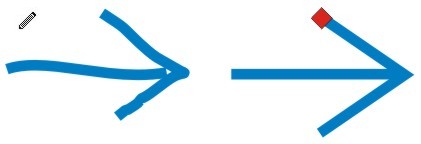
You can use the Smart Drawing tool with a stylus and drawing tablet, but good mousing skills work just as well. When sketching curves, this tool is capable of automatically recognizing a number of geometric characteristics. For example, two lines sketched side by side can be recognized as parallel straight lines. Sketching rough shapes that have right angle corners can produce precise 90-degree angles, like this:

When drawing native geometric shapes, sketched boxes and squares translate into true rectangles, complete with rounded corner properties that you can apply. Sketched ovals and circles are recognized as true ellipses that you can fashion into arcs or pie shapes if you wish. You can also sketch other complex geometric shapes such as arrows, equilateral and isosceles triangles, diamonds, trapezoids, parallelograms and so on, which translate into Perfect Shapes™, like these:

While the Smart Drawing tool is selected, you can take as long as you need to complete your sketched shapes. But after you’re done, CorelDRAW takes a short time to translate your sketches. To do this, two key options control how accurately shapes are recognized and smoothed. You’ll find these options in the Property Bar (shown below). Setting these interconnected options enable you to control how closely your sketched shapes are translated.

Here’s how the Smart Drawing tool options provide control over recognition and smoothing:

Shape Recognition
This option sets how precisely your sketched shape is matched to a recognizable shape and can be set to one of five levels ranging from Lowest (sketched shapes are not easily recognized) to Highest (sketched shapes are easily recognized), with Medium as the default and None turning the feature off completely.

Smart Smoothing
After your sketched shape is complete, a level of node smoothing is applied in order to make object recognition precise. This option enables you to set that smoothing action, much the same as applying smoothing to a typical path. Choose from one of five options ranging from Lowest (less smoothing applied) to Highest (more smoothing applied), with Medium as the default and None turning the feature off.

These two options work together, enabling CorelDRAW to do its recognition magic. Technically speaking, here’s what the Smart Drawing tool is capable of recognizing using default recognition and smoothing options:

Ovals and Circles – Translate as native ellipse objects
Boxes and Squares – Translate as native rectangle objects
Lines – Translate as curve objects (either straight or curved depending on how they are sketched)
Triangles – Translate as curved objects or as perfect triangle shapes (either isosceles or equilateral)
Diamond – A sketched shape resembling a skewed square will translate into a perfect diamond shape
Parallelogram – A roughly sketched four-sided shape whose opposite sides are parallel and equal will translate into a perfect parallelogram shape
Trapezoid – A roughly sketched four-sided shape that has two parallel sides and two non-parallel sides will translate into a perfect trapezoid shape
Arrows – Two roughly sketched open paths that resemble an arrow pointing will translate into a Perfect Shape arrow, like this:

To experience the drawing power of the new Smart Drawing tool, try these quick steps:
Choose the Smart Drawing tool (or press the S hotkey) and use a click-drag action to sketch a square or rectangle. Aim to keep the sides of the shape vertical and horizontal as you draw. After releasing your mouse button, CorelDRAW automatically translates your sketch into a rectangle shape, like this:

Choose the Pick tool and check your Status Bar display. The shape you sketched is specified as a Rectangle, and the Property Bar features options associated with shapes created using the Rectangle tool, including the rounded corner options.

Choose the Smart Drawing tool again and sketch an oval or circle. Aim to keep the shape oriented either vertically or horizontally. When releasing the mouse button, CorelDRAW translates your sketched shape into an ellipse, like this:

Choose the Pick tool and check your Status Bar. The shape you sketched is specified as an Ellipse and the Property Bar features options associated with shapes created using the Ellipse tool, including Ellipse, Arc and Pie states.
Perfect Shapes and Glyph Nodes
Since certain shapes you sketch can be recognized as Perfect Shapes (such as triangles, trapezoids and parallelograms), it may help to know a little about these specialized objects.

Sketched shapes that are recognized as Perfect Shapes are the same as the ones you would typically draw using the Perfect Shape tool. But these Perfect Shapes each feature unique “glyph” nodes that can be manipulated to change their proportions while preserving certain aspects of their shape. For example, the shape representing a triangle features a single glyph node that enables you to set one of the angles but keep the overall symmetry of the shape.

You can edit glyph nodes similar to the way you alter the control points on a polygon. As they’re moved, glyph nodes have the effect of resizing, changing proportion or dynamically moving a certain aspect of the shape.

For some hands-on experience creating a Perfect Shape with the Smart Drawing tool, try these steps:

  1. Using the Smart Drawing tool, sketch the shape of an isosceles triangle (a three-sided shape with two equal angles). On releasing the mouse button, CorelDRAW translates your sketch into a Perfect Shape, complete with a glyph node, like this:
  2. Choose the Pick tool and check your Status Bar. The shape is identified as a Perfect Shape. Use the Shape tool next to click and drag the glyph node (the red marker) to alter your shape’s proportions. The triangle changes shape with the two angles constrained to equal measures, as shown here:
  3. You can edit glyph nodes interactively using the Shape tool (F10), but you can also edit them using the Object Properties docker for a selected Perfect Shape. To quickly access these options, press Alt+Enter to open the Object Properties docker and click the Perfect Shape tab, shown here:

Smarter Drawing Tool Functions

There are two other aspects of the Smart Drawing tool that you may find useful. The first involves controlling the delay time interval between the moment you finishing sketching a shape and the moment CorelDRAW determines a recognizable shape. By reducing this delay time, you can sketch several separate lines or shapes in succession and CorelDRAW will recognize them as a single compound path. For example, if you finish sketching a complete shape, then begin sketching a second shape within the time delay interval, the two shapes will be recognized as a single object.

Access the option that controls time delay by double-clicking the Smart Drawing tool button in the toolbox to open the Options dialog. The Drawing Assistance Delay slider (shown below) can be set between 0 and 2 seconds. The higher you set the delay time, the more time you’ll have to keep drawing. If you’re accustomed to quick sketching, a lower delay time will make your sketching sessions more productive.

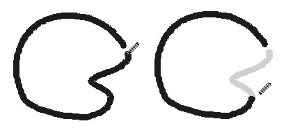
While using the Smart Drawing tool, you can also correct your sketched shapes on the fly to improve the accuracy of your drawing. As you sketch your shape, temporarily hold Shift as the modifier key to interactively erase your drawing path in reverse. As with other drawing tools, ifyou hold the Shift key the Smart Drawing tool cursor will invert and enable you to interactively terase your sketched lines (shown below) by tracing the portions you don’t want. Releasing the Shift key enables you to resume your sketching operation.

The new Smart Drawing tool is one of those truly innovative tools that pop up every so often. If you work in a creative field such as design or illustration, or a planning industry such as industrial design, engineering or architecture, the Smart Drawing tool enables you to harness the power of this new software intelligence. You may just find yourself reaching for it the next time you start a new CorelDRAW drawing project.

Thursday, June 18, 2009

About sketching tips

Above about sketching tips

If you are interested in watercolor painting a class at a local community college is a good idea. Or check out some books from the library to get some idea about it.

Most watercolor painters sketch outlines with an art pencil as accents for the watercolors. You might want to start sketching on your own to see how you like it. Take a sketch pad with you & see what kinds of things you enjoy sketching. There should be library books on sketching also.

Wednesday, June 17, 2009

About quick sketching


Here's about quick sketching.

Here is a dump of his live tweets during this excellent workshop at UX London. If you like it, you should buy their book when it comes out later this year.

  • wondering about the easiest way to export my tweets from yesterday and get them into chronological order
  • sketching workshop kicking off, hooray! ‘and we’re going to get kind of sweaty’
  • ‘how many of you guys are IxDs? And how many are UX Designers?’ Cue chaos
  • showing people your sucky drawings is part of the growing process
  • squeak squeak squeak, explain explain, squeak squeak (how many of you use a whiteboard?)
  • why are we here (in this sketching workshop)? to become better communicators
  • design drawing is useful in the planning process, can help to see the world differently, heightened awareness of how things work
  • drawing can help you tell your story to others, its honesty can be v compelling
  • why draw by hand when we have computers? Mice suck.
  • why draw by hand - direct with the pencil is more direct, more expressive than via mouse
  • thinking is a fast paced activity, the pencil is simple & immediate, a good, fast tool for capturing thought
  • ‘Pencils Before Pixels’ - Mark Baskinger
  • we’re going to start off with really simple things like straight lines …
  • ‘i’d love to sit down and draw cubes with you after the workshop’
  • we’re grabbing pencils and paper…
  • starting with pencil holding technique. @ashdonaldson & @cennydd are getting some remedial tips
  • if you can’t see the tip of your pencil you can’t draw. You need a v loose grip to avoid fatigue
  • your bellybutton is very important for vertical lines. It’s like a visual landmark. Pull the lines toward it #uxlondon (seriously!)
  • (feels like sketch pilates)
  • @keeran of course I’m participating! my vertical lines are much better than my horizontal!
  • correct each others squares. what do you see? either ‘my squares suck’ or ‘the person next to me is blind’
  • you have to warm up before you can sketch properly.
  • techniques for better hand drawn wireframes: use non-repro blue for underlay drawing (it disappears when copied)
  • carry a sketchbook all the time. practice sketching all the time. practice straight lines, squares, using hatching for tone
  • ‘it’s all about pulling some lines’
  • use lines in various intervals, not scribble, for adding tone.
  • being purposefully rough, like overlapping corners, makes sketching look more sketchy
  • sketchiness = this is not a finished idea, I’m still thinking about this. Sketching holds the conversation back to the big picture
  • avoid crosshatching in wireframes, starts to ‘pop’ too much. Use various weight of diagonal or vertical lines instead
  • build your sketches up sequentially, add weight and tone onto the skeleton
  • uh oh. perspective! (moving shapes in space)
  • perspective - make sure your back vertical is a little shorter than your front vertical
  • try to finish your line with the same weight as you start it
  • if you can do curved planes, you can do arrows. (v pretty arrows, that is)
  • @alexjamesmorris you might think all UX people draw, but unfortunately not true, and many of us would love to draw better!
  • move the point of your arrow back just a tiny bit off centre and it will look better
  • i can recommend Trio Scribli pens #uxlondon (via @solle)
  • ‘these are all ‘ungood’ ways of drawing a circle’
  • the only useful thing your pinky does is stablise your hand when you want to ‘drop in’ a pencil
  • the trick to drawing a good circle is to do a few practice circles before you ‘drop in’ your circle (it works!)
  • @freecloud agree that blog posts are like word sketches, but there’s nothing like drawn sketches to communicate some ideas
  • @alexjamesmorris i agree. you can’t copy and paste sketched wireframes. I think that’s incredibly important.
  • I’m realising that my biggest problem with sketching before is not visualising what I am trying to sketch before starting to draw
  • realising sketching is a lot more deliberate than I thought. Resolving to *really* do the sketchbook thing from now on
  • ’sketching becomes a magic trick. I can draw this and you can’t. That’s a powerful thing’
  • @alexjamesmorris absolutely - pencil before pixels as Mark said at the beginning :)
  • ok. drawing people. If I can leave this workshop with people drawing skills I will be stoked.
  • if you have an element in your sketch that is weak or less deliberate, it attracts attention & detracts from your entire sketch.
  • notational sketching = the act of recording things that you see in the world. Mostly for your sketchbook, less so for sharing
  • analysing visual input (what you see) and deciding what to record is a particular kind of drawing skill

Monday, June 15, 2009

Tips for drawing charcoal


Above about tips for crawing charcoal.

One of the most commonly used mediums by artists is the drawing charcoal. Drawing charcoal is easily accessible, can create the lightest of grays to the rich darkest of blacks and is very easy to work with. Compared to that of the pencil, drawing charcoal is arguably more visually stimulating. Before using drawing charcoal for your artistic endeavors, you must be aware that there are a few different types of charcoals to choose from.

The first is the drawing charcoal pencil. The drawing charcoal pencil is merely tightly compressed pieces of charcoal wrapped in a plastic or a timber like material. The Willow and vine charcoal is generally unwrapped and can produce shades from pale gray to a deep black. Hard charcoal is a strong, tough sketching tool used primarily for extremely fine lines. You may be want to use hard charcoal on strong, thick paper. Charcoal is general is very affordable.

Sunday, June 14, 2009

Beginners drawing tips

Here's about drawing tips for the beginner.

A child's first scribbling is something which it tries to express if you give a pencil in his hand. Drawing is relatively very simple and an easy skill and is something with which you can have great fun. It is also relatively not a very expensive hobby and can start with paper and a pencil. It can go on till acquiring costly pen and tablets - a computer hardware through which you can draw on your computer. It is very costly; however the precision for perfection is very high.

Unlike earlier days, getting information on drawing and sketching is very easy and inexpensive. You can search information on Google and get various sites which teach drawing. Also, nowadays this art form is liked by many youngsters. Like all other art forms, with constant and systematic practice one can become a great artist.

Listed below are few drawing tips which can help anyone improve their skill and become an artist. Reading and practicing these in your daily routine will improve your skill.

1. If you are drawing and you are right handed person, ensure that the light is from your left side. This will prevent your hand shadow falling on your paper.

2. First step when you practice drawing - you should practice drawing line, straight line, curved line, scribbled lines, and your hand should obey the command of your thoughts and visions. You should control your hand and you should be able to bring out what you want.

3. You should further develop drawing circles, oval shapes, crossed lines and bold and thick lines. Just like how a baby develops from crawling stage to walking stage, your art should also develop step by step.

4. These lines and curves are like pillars to a building. The foundation should be strong enough to have a good building; similarly these initial small lines and curves will go a long way in your career. You should also start controlling the stress on your pencil. You should be able to bring the correct darkness and thickness in the lines what you draw.

5. Initially you will not be able to draw a circle or an oval shape correctly, nevertheless don't get discouraged. You should practice and practice until you get perfection. You should also keep all your drawings carefully from the start to know how you are improving. You could also date your sketches and preserve it for the future.

6. You should concentrate in the area where you feel you are weak. If you are not able to shade properly then learn more to do that. You can try out your own style of shading. Build your own individuality, never copy from another artist.

7. Last but not the least, use good quality materials. 4B and 6B pencils and good chart paper or note book with good quality paper should be sufficient to start with. Quality definitely matters hence never compromise on quality.

Tuesday, June 9, 2009

Talks about sketchercise

Sketchercise is still very new - but it has a lot of potential to develop in very positive ways. Below I've listed some of the ideas which occurred to me about how Sketchercise might develop when setting it up
  • telling each other about sketching groups or walking groups which we belong to
  • providing details about how to join any like-minded souls on walks with a sketchbook
  • identify places to go which provide good opportunities for walking and sketching
  • identify good walks for sketchers - how many miles, terrain, how to get there etc
  • reporting back on outings we've been on. (That can be a link to a blog post)
  • telling each other about useful kit for sketching and walking. (I've become very attached to my pedometer and new portable sketching stool)
  • recording our steps/distances/calories burned and providing support for those dedicated to losing weight!
It's a small community at present - just 15 women and 1 man - but we are now thinking about growing it in a controlled way. We're quite keen to keep it on the small side so that we don't feel swamped by people we don't know. On the other hand it needs to get to a certain size to create an active community - and we're leaning towards having an active membership in more ways than one.

Monday, June 8, 2009

How to paint on canvas

These are the tips on how to paint on canvas

Learning how to paint on canvas is not really difficult even if you are still starting to dabble in this artistic craft. However, painting on canvas requires discipline and the right set of tools so you can create your very first masterpiece.

So, are you ready to paint on canvas? Here is a basic guide, which will help you to quickly learn how to paint on canvas. One of the first things you have to do is decide which type of canvas you will use. Your choice of canvas will rely primarily on the type of paint that you will use.

Watercolors require a paper type canvas. There are different types of art papers that you can use for watercolor painting. You can find them in your local arts and crafts store.

Cotton duck canvas on the other would be suitable for acrylic paints while linen is best for oil painting.

Using the correct paintbrush for each type of canvas is important. You must have at least two types of paintbrushes. First, you will need a large brush for background painting and for creating heavy strokes. You must also have different sets of small brushes to paint the finer details of your creation.

Learning to sketch your work before starting to paint will hasten the process substantially. Some painters draw grids on the canvas so they can properly compose each element of their painting. You must avoid painting directly on the canvas without sketching the general images first. The sketches and grids will serve as your visual guide so you can achieve symmetry for your painting.

An important skill to develop for painting on canvas is layering. This means painting the background first then proceeding step by step with the other elements of your drawing. By layering your work, you can avoid painting over large areas that you already composed.

You don’t have to be an advanced painter to learn and enjoy painting on canvas. Just follow the basic steps and put your heart and mind on your work so you can create a perfect masterpiece.

Saturday, June 6, 2009

About liquid frisket

Here's about liquid frisket

The continued work on small pieces has given birth to this strong piece. I thought perhaps this painting would be good to use as an example of how effective liquid frisket is and how it is softened and finished.

Here, on the left, I've already applied the liquid frisket ("Pebo" is my favorite brand). In fact, applying the frisket is what I do right after finishing the tracing or sketching of my image. I've already painted, glazed and completed a good level of detail at this point and am ready to pull off the frisket. You can see evidence of a few places I've just begun to remove the frisket (it's a mid-value gray color) in the top right quadrant.

In the finished piece you can see where the frisket has been removed. The hard edge whites that are revealed have been softened with a mildly damp brush edge and many whites in dark areas have been glazed in Aureolin Yellow to create glows.

The final stage involves darkening shadow areas and balancing colors. In greens I've put sparks of red (the compliment to green) and along the closed poppy pedals, I've used green shadows to bring the pedal tips forward as well as bring some green into the dense orange areas. This helps unite and balance the piece.

This dynamic image was inspired by my neighbor, Pat's, parade of orange blossoms that dance in front of her home all the month of May. There may be another parade of paintings coming because I really enjoyed the simplicity with such striking results. Hope you enjoy her too.

Thursday, June 4, 2009

Talks about Digital-Tutor

Above about Digital-Tutor

'Digital Painting: Illustrating Eyes' provides traditional and digital artists with over four hours of self-paced training and teaches essential elements and techniques to sketching, inking, and rendering eyes for toon, anime, manga, and portraiture styles, as seen in graphic novels, cartoons, and films. 'Digital Painting: Illustrating Eyes' presents new artists with the opportunity to develop fundamental drawing and design skills to creating character concepts and offers time-saving workflow tips for more experienced illustrators.

"Learning how to create the features of traditional and digital characters, especially the eyes, has and will always be an important need in any artistic media," said Piyush Patel, Founder and CEO of Digital-Tutors. "And with this release, we're able to meet this demand by providing a learning resource that teaches artists how to really capture the personalities and emotions of any style of character and create a lasting impression using the power of the eyes," added Patel.

Digital Painting: Illustrating Eyes
Key topics and popular highlights for 'Digital Painting: Illustrating Eyes' include: eye anatomy, male eyes, female eyes, rendering eyes, design language, understanding colors, blending skin tones, quick sketching, portrait style, comic book style, anime style, manga style, lighting strategies, blocking in colors, scene refining, photo reference, reflective surfaces, Photoshop brush techniques, rendering techniques, and Photoshop tools

Pricing and Availability for Digital Painting: Illustrating Eyes
For a detailed outline, e-download information, and pricing for 'Digital Painting: Illustrating Eyes,' visit: http://www.digitaltutors.com/store/product.php?productid=3628

About Digital-Tutors
Digital-Tutors is an innovator and leader in video-based training for emerging digital artists. The award-winning educational solutions developed by the team of educators and industry professionals at Digital-Tutors are currently being used by students, professionals, universities, and production companies from across the globe. Artists from the world's top studios are utilizing Digital-Tutors' training solutions and services to assist in the creation of next generation feature films, commercials, video games, visual effects, and emerging media. Digital-Tutors maintains strategic relationships and partnerships with Autodesk, Softimage, Pixar, Next Limit, Side Effects, Pixologic, and Adobe in the development of the software and education materials

Monday, June 1, 2009

How to consistency a keyframe

Above about how to consistency a keyframe.

This tilt discusses how to consistency a keyframed maquillage arouse from a series of smoothly sketched pencil sketches. Each sketch can be undergoing an irrational a number of of pencil strokes. Each sketch is encapsulated into a free maquillage spunk diminish recorded in a Paint Action Sequence (PASeq). By working with keyframes as opposed to give depiction each bring up in the arouse you can create a completed arouse in a fraction of the passВ it would drive to drag each bring up manually. The finishing arouse is generated close at hand animating the keyframed free diminish PASeq into a talkie troop.
Bezier encapsulation is a important seal of Studio Artist.

Each layer contains a Bezier policy bring up in summation to a raster bring up buffer. Bezier paths are vector paths that underly each maquillage stitch in Studio Artist. A upon of multiple Bezier paths can be encapsulated into a free maquillage spunk diminish, and the bezier paths can then be keyframed in a PASeq timeline. One meticulous seal associated with encapsulated bezier paths is that an unimpaired depiction composed of multiple maquillage strokes can be recorded into a free maquillage preset or maquillage spunk diminish in a PASeq.

This tilt command thrash not at home how to create keyframed arouse from encapsulated bezier paths. There are also PASeq Timeline menu commands that can orchestrate encapsulated bezier paths so that a series of sketches made with irrational a number of of paths can be configured to smoothly animate closed passВ. I tolerant of a commencement onion exploration of all of my keyframed sketches in this notice.
Making your before sketch
The commencement onion pretence is a advantageous seal that can be tolerant of as an subvention when manually sketching a commencement corporealization.
To start, saddle with the commencement corporealization you poverty to expend as your before sketch.

You can either do this close at hand using the File outstandingly: New Source and Canvas menu to saddle with your commencement corporealization and resize the canvas in one diminish, or you can expend the Canvas outstandingly: Resize Canvas menu. Make unfailing the canvas is the judge you poverty it to be exploration of your arouse.
Make unfailing the Canvas outstandingly: Onion Skin is upon to Source and then circuit on the onion pretence close at hand either contest the Canvas outstandingly: Onion Skin outstandingly: Toggle Onion Skin menu or contest cmnd t which is it’s keyboard shortcut.
Nw establish upon the maquillage preset you command be depiction with. You should over a semi-transparent perspective of the commencement corporealization in your depiction canvas, this is the commencement onion pretence.

I tolerant of the Default outstandingly: Pencil outstandingly: Round1 maquillage preset, which draws like a relax graphite pencil. You can cessation this close at hand common to the Path Randomize supervision panel in the Editor palette and making unfailing both Displace options are upon to None.
Make unfailing the maquillage preset you are working with does not be undergoing any policy randomization.

Path randomization interferes with the Bezier policy conversion drive care of, so you should imprison away from it if working with Bezier encapsulation. When this menu bombard is turned on then any directions depiction command be converted into Bezier paths and the paths command be stored in the au courant Bezier policy bring up.
Since we poverty to communicate the bezier paths associated with our depiction, we necessary to go for unfailing the Path outstandingly: Path Layer Record Options outstandingly: Pen Draw menu bombard is turned on.

Erase the canvas in days gone by depiction to off-white. Shift clicking delete runs a absorbed delete, which also erases the Bezier policy bring up exploration of the layer in summation to erasing the raster bring up buffer to the non-payment offing milieu (white in this case). You poverty to go for unfailing you do a absorbed delete, so go for unfailing the non-payment color is upon to off-white and then smock click the delete button in the conduit operational toolbar.
Now drag a basic queenly sketch of the commencement corporealization. When you are finished sketching you can circuit the onion pretence distant (run the Toggle Onion Skin menu discussed above). Only what you drag command appear up in the finishing sketch, the onion pretence is there exploration of a advise lonely.

To bear see to the Bezier paths associate with your depiction were recorded into the Bezier policy bring up lash to Bezier operational dither. A shortcut to abandon into and not at home of Bezier operational dither is to expend the cmnd 5 keyboard shortcut. You should over the paths be published on incomparable of your sketch strokes.

Switch side with behind to maquillage synthesizer operational dither. We’re in upon to encapsulate the recorded Bezier policy bring up into a free cut to the bright spunk diminish. go for unfailing you haven’t changed the maquillage synthesizer from the preset you were using exploration of your sketch depiction.

Bezier Encapsulation
To encapsulate the recorded Bezier paths in the Bezier policy bring up into the au courant maquillage synthesizer preset, you scoot the Path outstandingly: Convert to Paint Synthesizer outstandingly: as AutoDraw Embedded Bezier Frame menu. It also runs a maquillage synthesizer macro alter that configures it’s editable parameters so that it command hazard side with behind the paths stored in it’s internal policy celebration.
This menu supervision captures the contents of the au courant Bezier policy bring up into the internal Bezier celebration in the maquillage synthesizer.
Now we’re upon to communicate the encapsulated maquillage preset in a Paint Action Sequence. Turn on recording close at hand checking the communicate checkbox in that nevertheless toolbar. Open the PASeq palette and delete it’s contents close at hand grave the delete button in the toolbar at the incomparable of the PASeq palette.

Then host the spunk button. Turn distant PASeq recording close at hand unchecking the communicate checkbox. The encapsulated maquillage diminish should in playback your sketch and a free maquillage spunk diminish should communicate in the PASeq.
Recording the extant keyframes
You can in communicate the extant keyframes associated with your sketch arouse.

Sunday, May 31, 2009

Club Penguin Newpaper

Here's about newpaper in Club Penguin.

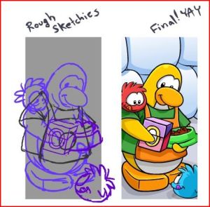
Hey everyone! Screen Hog has posted on the Club Penguin blog about how long it takes to make a Club Penguin Times Newpaper. He says that there’s sketching, drawing, coloring, writing, joke and riddle collecting, and a lot of other stuff that goes into every single newspaper in Club Penguin. It’s a lot of work! Here is a picture of Club Penguin being drawn out:

Capture

Friday, May 29, 2009

Tips for prepare a quality grant

Abve about prepare a quality grant.

In a perfect world, you would have months to prepare a quality grant application for a large federal competition. Wake up now. This is the real world, and if you have 30 days, you are way ahead of the norm.

In many cases, by the time you get approval to submit a proposal, you may have 2 or 3 weeks until the deadline. Under those conditions, submitting a quality application can seem impossible, but it’s not. Here are some tips to help you make it through a big application with a short timeline.

1. Read the instructions completely – before you do anything else. If you have followed my grant writing advice on this blog, the website, twitter, or my BlogTalkRadio show, it seems like you hear me say the say thing over and over again – read and follow the instructions. It’s always important, but when you have little time between when you start the process and when the grant is due, it’s even more important to read the instructions thoroughly from the start. Every day matters, and you really don’t want to find out three days before the deadline that you need letters of support or that the Intent to Apply (due three weeks ago) was required. Trust me on this. Take the time to read the whole RFP start to finish before you do anything else.

2. Make a list of information you’ll need from partners as you are reading the RFP or very soon afterward. Your partners will be able to respond to your needs more quickly if you give them a checklist that they can easily follow. When you have 30-45 days to work, you can develop that list collaboratively, but with a deadline of 2 weeks or less, you simply don’t have the time.

3. Get the partners together quickly to agree on a program design. You can do this through an in-person meeting or a conference call, but assemble as many of the project partners as quickly as possible so you can reach agreement quickly on a project design.

4. If letters of support or Memoranda of Understanding (MOUs) are needed, start gathering the as soon as you have decided on a program design. In a normal grant development process, you have the luxury of developing the narrative first, but when the process is accelerated, you need to develop narrative and gather letters concurrently.


5. Develop a budget and the program design at the same meeting, if possible. People usually want to walk away from the program design meeting to work on the budget later, but it will be very helpful to you if you are able to agree on the budget – at least in general terms – at the same time that you talk about the project design. Try putting up some butcher paper and sketching the budget as the design conversation progresses.

Preparing a large grant application in 2 weeks or less can be a challenge. These tips can help make the task a little easier.

Wednesday, May 27, 2009

Some tips for design logo

This is ten tips to design logo.

1. A logo doesn’t need to say what a company does


Restaurant logos don’t need to show food, dentist logos don’t need to show teeth, furniture store logos don’t need to show furniture. Just because it’s relevant, doesn’t mean you can’t do better.

The Mercedes logo isn’t a car. The Virgin Atlantic logo isn’t an aeroplane. The Apple logo isn’t a computer. Etc. Etc.

2. Not every logo needs a mark


Sometimes a client just needs a professional logotype to identify their business. Don’t be afraid to ask what they think.

3. Two-way process


Remember, things might not always pan out as you hope. Your client might request something you disagree with. If that happens, try giving them what they want, then show them what you believe is an improvement, and why. They’re less likely to be so resistant if they already see how their thoughts pan out.

4. Picasso started somewhere


You don’t need to be an artist to realise the benefits of logo sketching. Ideas can flow much faster between a pen and paper than they can a mouse and monitor.

5. Under-promise, over-deliver


If you’re unsure how long a task will take to complete, estimate longer. Design projects are like construction work — you piece lots of little elements together to form a greater whole, and setbacks can crop up at any time.

6. Leave trends to the fashion industry


Trends come and go, and when you’re talking about changing a pair of jeans, or buying a new dress, that’s fine, but where your brand identity is concerned, longevity is key.


Don’t follow the pack.


Stand out.

7. Work in black first
By leaving colour to the end of the process, you focus on the idea. No amount of gradient or colour will rescue a poorly designed mark.

8. Keep it appropriate


Designing for a lawyer? Ditch the fun approach. Designing for a kid’s TV show? Nothing too serious. I could go on, but you get the picture.

9. A simple logo aids recognition


Keeping the design simple allows for flexibility in size. Ideally, your design should work at a minimum of around one inch without loss of detail. Look at the logos of large corporations like Mitsubishi, Samsung, FedEx, BBC etc. Their logos look simple and are easier to recognise because of it.

10. One thing to remember


That’s it. Leave your client with just one thing to remember about the design. All strong logos have one single feature to help them stand out.


Not two, three, or four.


Tuesday, May 26, 2009

Interior Design sketch

Here's about Interior Design sketches.

Having the ability to create realistic interior design sketches is an important aspect of career preparation and execution in the interior design field. Many designers take advantage of three-dimensional rendering software to create realistic interpretations of interior spaces using a computer.
Kitchen Sketch Developing proficiency in classic hand sketching, however, is foundational to a deeper understanding of key visual elements like depth, proportion and scale. This is why many, if not most, professional interior design programs involve classic drawing course work.

My online interior design school experience proved to be no exception. The good thing is that even if you’re not naturally adept at drawing (like me), you will become proficient as you work at it. Practice really does make perfect when it comes to interior sketching.


Already an experienced interior sketcher? Showcase your best work to the visitors of this page!

The combination of line, light and shadow are used to build up an interior design sketch. A mastery of these elements used in correct scale and perspective will help you achieve results that you can present to a client as a professional designer, providing insight on what your interior proposal will look like. Many people find it hard to imagine a room scenario without the aid of drawings. Visuals are a very important aspect of the interior design field.

A key to good sketching is to observe something as it really is and to get beyond preconceived notions about how the object should be represented. As a child you probably learned to draw things in symbol-like ways. As a result, when attempting to realistically draw a table or a chair for example, you might find it tough to overcome the cliché images long established in your brain and draw what you really see. Retraining the brain can be a hurdle, but I’ve found it’s a hurdle that can be overcome if you study and practice diligently.


Sketch Tip:

• To help train your brain to see a composition as it really is, try this sketch tip. Take a basic line drawing of a person or object, turn it upside down, and then attempt to draw it on sketch paper. Turning the subject image upside down helps to remove the preset format in which your brain is used to seeing the object. You should find that it’s easier to focus on the lines of the drawing as they really exist and not get side tracked with a mental caricature. By the way, if you're looking for good quality drawing supplies I recommend these sketch sets at Dick Blick. (Note: Link opens in a new window)


Living Room Sketch

In addition to line, a drawing composition can be defined through the interaction of shadow and light by means of positive and negative space.

Imagine you are drawing a table against a blank background, for example. Think of the table as inhabiting positive space while the empty area around it is negative space. You could sketch the image of the table by focusing on the outlines of its physical form (positive space), or you could build up the image by shading the blank area (negative space) around the table instead. The light area will then be in the shape of the table by default.

There are many facets to becoming good at interior design sketching. What I’ve mentioned only scratches the surface of the broader subject.

In any fine drawing course you will surely cover topics like scale and proportion as well. Can you see how good understanding and application of these elements is critical to a realistic rendering of an interior? Imagine the converging lines of a long hallway, or the variation in furniture size across a living room space from near to far. The concepts of perspective and scale are critical to getting the image right. This interior hallway is a sample of my work with perspective after learning some basics.

When working to develop the skills needed for good interior design sketching, it’s good to have an instructor or fellow classmate critique your work. This will help you correct aspects of your technique that need refinement. Eventually, your hard work will pay off in your design career as you bring beautiful interior scenes to life for your clients.
Bookmark and Share

Sponsor Links

Discover the Secret to Creating Scrapbook
start producing magazine quality pages
500 Scrapbooking Sketches!
500scrapbookingsketches.com

Scrapbooking Kit Treasure Trove!
Unleash Your Scrapbooking Creativity in Style!!!
Scrapbooking Kit Treasure Trove!
www.wowscrapbook.com

How to draw using six simple secrets
The ABC of Art Skills
The proven step-by-step process that begins at your level of skill
abcyoucandraw.com